This part of the webpage I will show examples of the work that our class has done on Adobe InDesign. In order for you to understand more about the process I will add a description with the image.

I created this poster for the Sawdust Art Festival because I thought it looked simple and had a good color scheme. I wanted it to look artsy because it is an art festival and tropical because it is in Laguna Beach. I choose the font for the heading because it looks like it has splattered paint on it which I thought would be good since there will be artists at the festival and it will appeal to people who like art. I choose to put a picture of Laguna Beach in the poster and blend it in with the color of the poster to make the backdrop. I used four colors for the poster: red for some of the words, dark red for some of the words, light green for the background, and white for the text. I used the different colors of red for the words so that they would contract and make some things stand out more. I decided on white for the text because the background was somewhat dark, the white words stood out more than the black words and went along better with the theme of the poster. I also used white lines around the text to give it more structure. I put some of the words in the form of a triangle in order to make it more unique and because it was more visually compelling than simply centering the text. I also made the Sawdust Art Festival the biggest words so that they would stand out the most and wrote Sawdust even bigger so that it would stand out the most. I alternated between using red and dark red in the large words because it made them more visually interesting. I also made the website a different color then the other text because I thought it was important in promoting the event.

I choose to put the calendar at the bottom of my page and the pictures of the animals, the fun facts, and the coupons on the top off the page. I wanted each month to look different so I used different color patterns for each month. I choose to do the month and the year the same color as a color in the calendar in order to incorporate the colors in the calendar to the top half of the page. I also did the color of the fun fact the same as a color in the calendar. I tried to make each calendar different so that it would be diverse. On the way calendar I used a lot of green because the picture of the rabbit was in the grass. I also did an outline for 2012 May because I thought it emphasized the heading. For April I used green and orange as the two main colors for the calendar and the text. For March I used light blue and purple for the colors.

I decided to use a simple color scheme of orange, yellow, and blue. I wanted the design to be simple as well so it would look good at 6 in and 1 in. I put the company's name inside the sun because it goes along with the name of their company. I choose the colors yellow and orange because those are the colors associated with the sun. I choose blue for the other color because that is the color of many solar panels. I added the smiley face to add character and originality to the design. I also made the smile look unique by not doing a perfect smiley face.
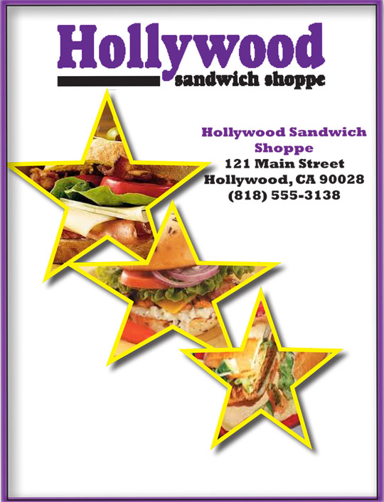
I choose my color scheme of black and purple for the text based on the logo for the Hollywood Sandwich shop. I wanted it to be simple and not have too many colors. I choose to put stars on the front page of the menu in order to incorporate the theme of Hollywood into the menu. I wanted it took embody the walk of fame. I also added yellow on the object styles because I thought it added an extra touch to the starts. I put sandwiches inside of the stars to show what kind of food it is. I put a purple border around the front page and added a shadow to it so it would be more visually interesting. I decided to put the price on the next line instead of putting a tab of periods into it because it did not look right with the descriptions of the sandwiches. I made the George Clooney my special feature because I thought he was a very well-known present celebrity. I also put his face in the shape of a circle to add some structure to it.